Behind the page
The Magic Behind Tome's Color Algorithm and Themes
Why we built themes 🎨
Color is an essential expression vector in visual storytelling. Sometimes we want our stories to feel bold and cinematic (the inspo behind Tome's original “Dark” theme). Or, we might want colors to feel playful, reflective, or match a brand book.
After we launched our beta in March, many of our early users told us they wanted a wider range of color options, as well as an easy way to use their own brand colors. We didn't want color application to be the painstaking hassle they were used to.
So a few months ago, we set out to build a themes product that would let you instantly apply your brand colors across a tome or make your own theme. And we wanted your theme to automatically look great.
If you'd like to dive in deep, here's the tome we used to kick off the project:
We had two guide posts 🧭
1. Color shouldn't distract from the content. We don't think color should be a random wallpaper or compete with your narrative. It should always complement or spotlight your ideas.
2. Achieving color harmony shouldn't be time-consuming or hard. It should be frictionless. And you shouldn't need to be a color theorist to build your own magical, harmonious themes.
Our now-live themes product hinges on both ideas. Now with themes, you can apply brand colors across your tome with a click. And if you want to create a new theme, our magic color assistant, the Auto toggle, lets you instantly make an attractive, legible theme. (We'll dive into how it works in a sec).
The result: you never have to worry if the colors across your tome's text, background, and UI jive. Most importantly, your story looks put together no matter what.
“We want to avoid the color compatibility dance, where you repeatedly iterate over color decisions until finding harmony. Tome should do that dance for you.”


The magic of Auto color ✨
Tome gives you full control over your theme and color choices. But there's no reason you should have to make every decision manually if you don't want to—that's where the Auto color toggle comes in.
When flicked on, Auto color makes sure every colored element on your tome, i.e., a page background, text, embed, a table, or your workspace—looks beautiful and easy to view. You just make one choice—your page color—and Tome takes care of the rest.
Let's break it down:
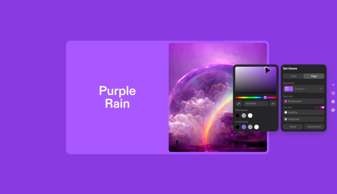
Pick a page color
When you choose a page color, Auto color is turned on by default. Your tome's canvas, heading, and text colors automatically adjust to jive with your background.
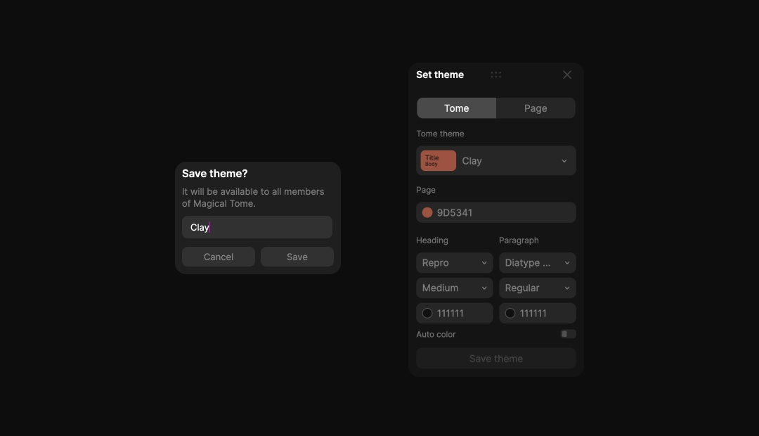
Save your theme
You can save any theme you like to use again. Or if you have a brand theme, you can create it using the eye dropper or Hex values and save it, so anyone in your workspace can use it too.
Override a color
If Tome's Auto color picks don't fit the bill, you can always veto them with the colors of your choice.
Apply a saved theme
With just a click, you can apply any saved or preset theme to update your whole tome.
Under the pixel
Behind Auto color is an original color algorithm made by Tome's design team. That color algorithm operates in what's called the LCH color space (more on that soon). When a page color is chosen, Tome makes a series of decisions on the fly to output a color palette that prioritizes:
- Monochromatic cohesion (making sure key elements share an underlying hue)
- The legibility of typography, and
- Visual hierarchy across elements
Let's dig in.
Why LCH?
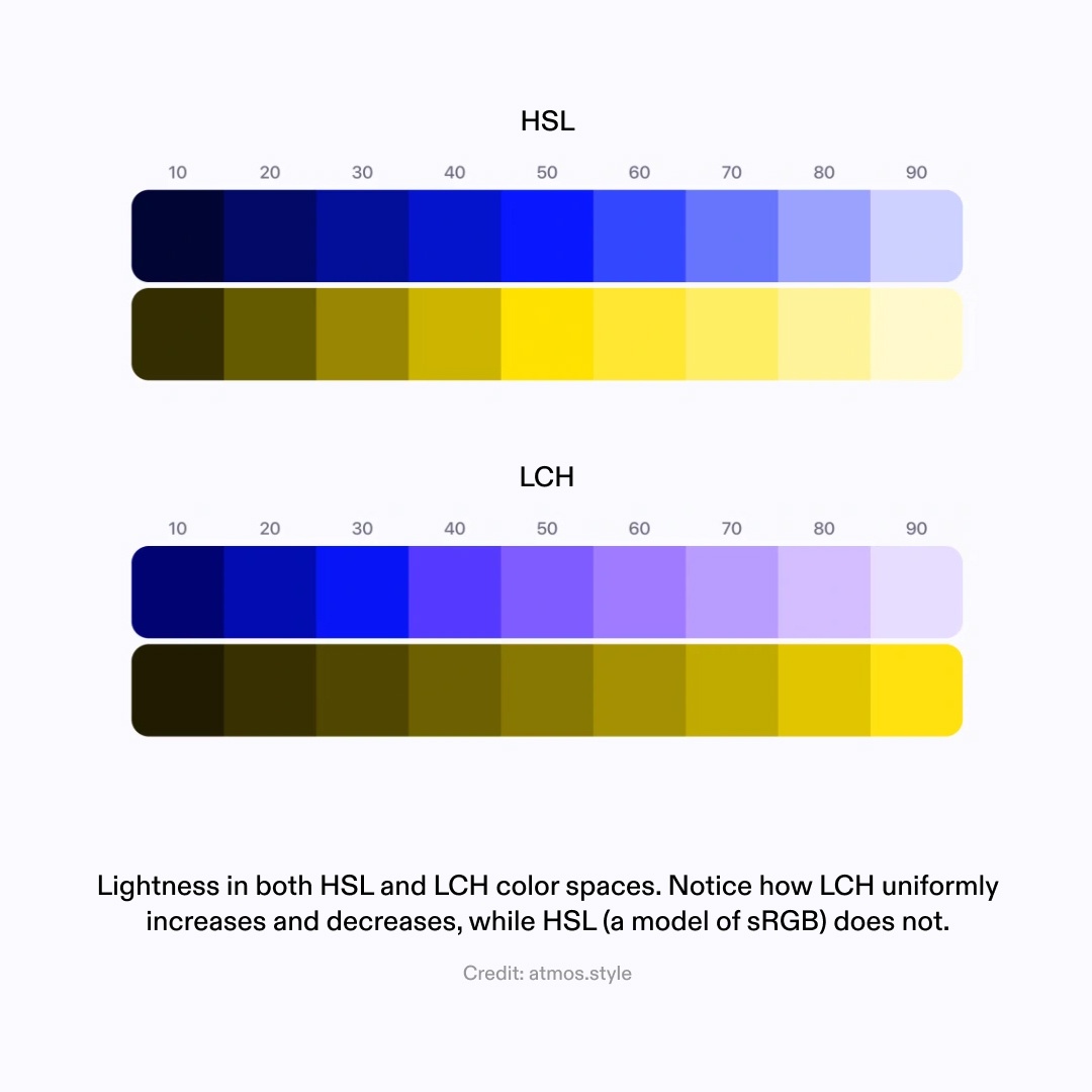
LCH stands for “Lightness Chroma Hue.” This color space (aka a fixed range of possible colors) differs in some key ways from other color spaces like sRGB, which is historically used in design tools. For Tome, LCH was a better choice for themes because:
- LCH is perceptively uniform, which means that modifying any of its three variables by a certain amount will always have the same perceptual color difference to the human eye.
- Most monitors can display far more colors than what the sRGB space covers. LCH lets us tap into a wider range of colors, which tend to be vivid and beautiful.
The color algorithm
When a page color is chosen, it's converted to LCH. Based on its inherent chroma and luminance, the base color is then used to generate complementary title, body, and canvas colors.
Depending on where a base color falls in the LCH color space, L C or H are tweaked to achieve a monochromatic theme that's perceptively uniform, easy to view and read, and just looks great.
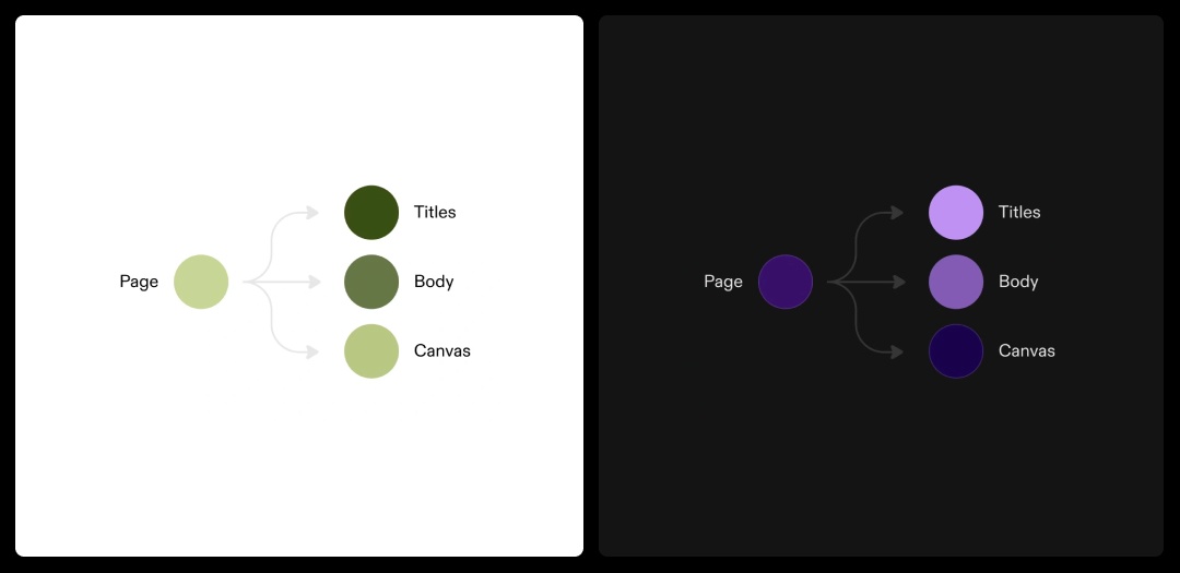
“There's no need to understand the color wheel—just play with a single color and get an output that's pleasing and fits your content. That's what makes it feel so special. ”


Creating UI modes
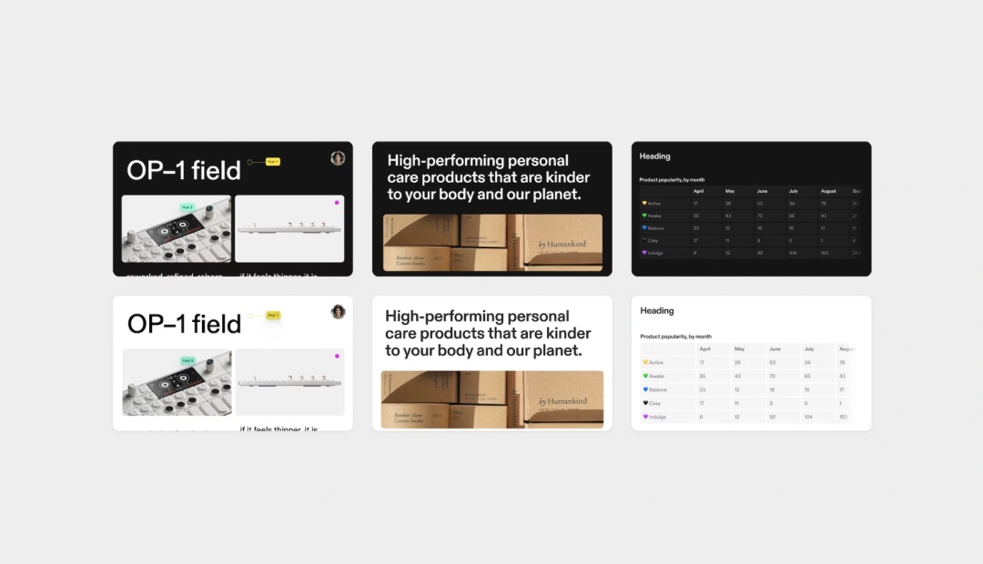
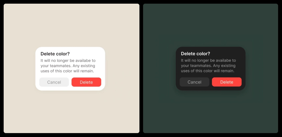
An important, but less obvious part of themes' magic is making sure that Tome's UI and native elements like tables are legible with your colors. So, when you adjust your theme selection, Tome's UI will automatically switch between light and dark modes to provide enough contrast between the UI and your tome's colors.
Light vs Dark UI
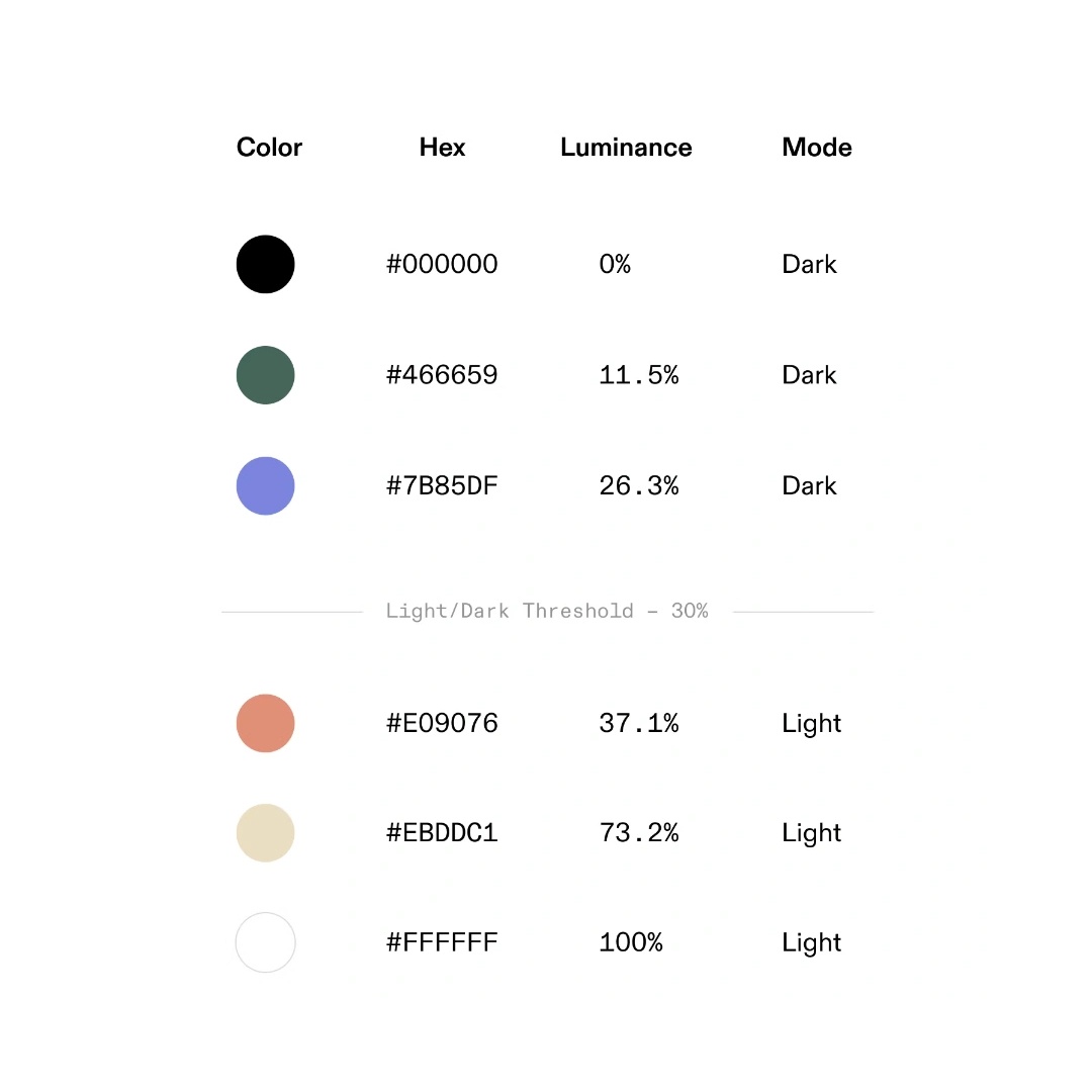
Tome's UI controls are based on an assessment of page color and relative luminance, a linear measure of light that's weighted for human vision. If the luminance is above 30%, Tome switches to a light UI. If it is below 30%, users will see a dark UI.
Because UI components sit on top of the theme surface, the change in UI treatment ensures there's sufficient contrast and legibility between the theme colors and the UI controls.
Color Scale
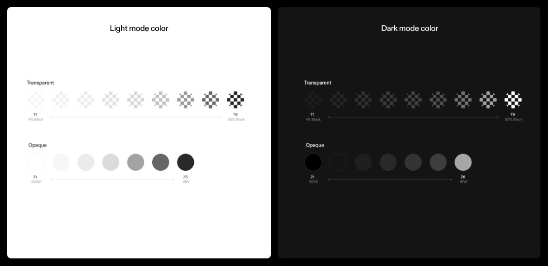
Originally, Tome's only theme preset was our Dark theme, which uses a single color scale optimized for darker UIs. With the launch of themes, we created a light mode UI to support the use of lighter colored themes. The light and dark UI modes are comprised of two elements:
1. Transparent colors: used mostly for UI elements (i.e., inputs, buttons, icons)
2. Opaque colors: used mostly for text and large surfaces (i.e. modals, dialogs)
Thanks for checking out custom color & themes! 🎨
We hope themes give you a more authentic, satisfying range of expression as you craft your narrative. We can't wait to see what you create.
Let us know what you think over email at team@tome.appp, at our Tome Help Center, or on X @magicaltome.
Until next time. ✌️
You may also like...
Learn how creators, entrepreneurs and teams can share their best ideas with Tome Pro.

Sit in on a conversation between our engineering leaders for their insights on how they’re moving the AI needle at Tome.