Success Spotlight
Why Social Media Pro Karin Kildow Chooses Tome to Craft Successful Strategies
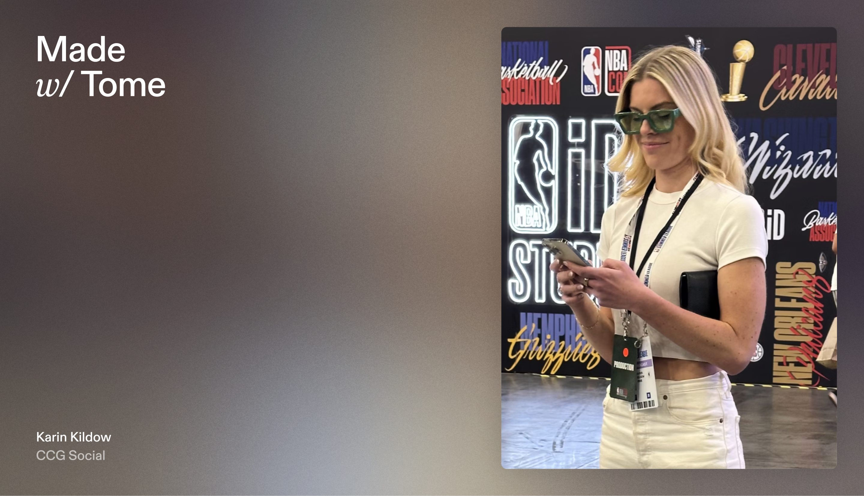
Meet the Founder
Time moves faster in the world of social media. For Karin Kildow, founder and CEO of The Content Capital Group, a social media agency for high-profile athletes like DeAndre Hopkins and Patty Mills, every second counts.
While content creation is a large part of her job, Karin also teaches clients and employees her proven framework for stellar content. Instead of teaching in real time, Karin created a sleek and interactive tome titled, How to Craft a Winning Social Media Strategy, to take the training off her hands. Keep reading to learn why we think Karin’s tome works so well, and how she uses key Tome features to build her modern training guide.
“Tome helps me scale my company's processes and organization tools. It makes it easy for me to share beautiful, narrated training guides, so I don’t have to walk people through everything in person. Instead, I can focus on strategy and creative work.”


Record narration: Deliver information without walls of text
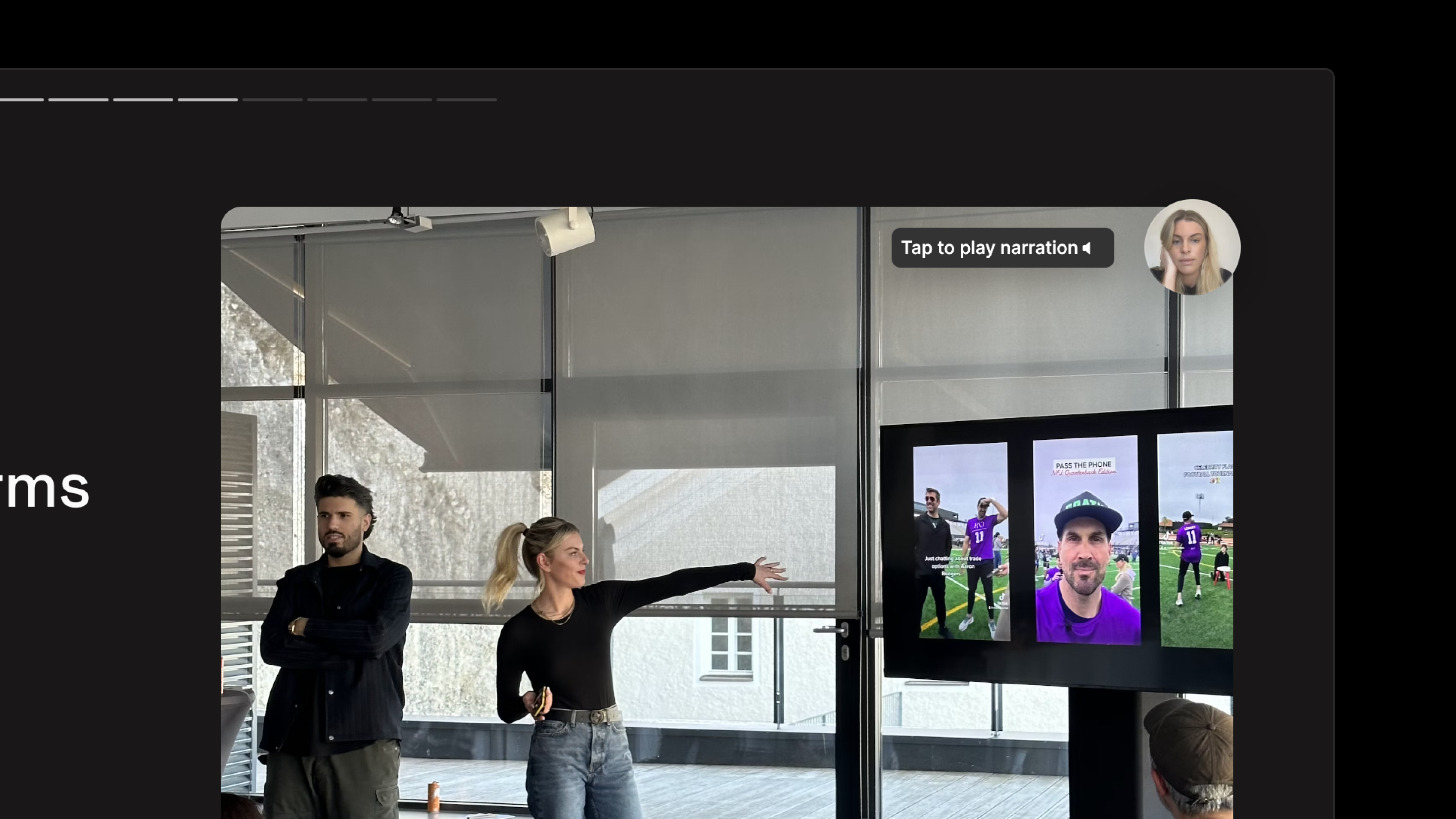
Cover pages are usually straightforward, but Karin adds a personal touch by recording video of herself introducing her tome and its purpose. Her voiceover also plays a significant role on nearly all of her tome’s sleek pages.
This allows Karin to highlight key points and add information without overwhelming the user with too much text. And because the recording appears as a bite-sized video at the top corner of the page, users can hear and see Karin with an unobstructed view of the presentation.
💡 Tome Tips
Nobody likes to read seemingly endless pages of text. That’s why we built the Record narration feature. It’s especially useful when you need to:
- Present a substantial amount of information.
- Share data.
- Explain something complex.
- Provide contextual details best conveyed verbally.
To record a narration, simply click the Record icon at the top right of your workspace.
Differentiate sections with color and bold elements
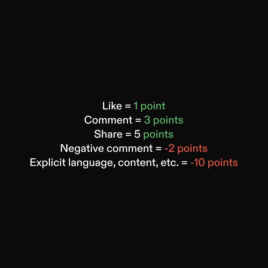
There will always be people who prefer to click through a presentation rather than read from start to finish. So, for skimmers, Karin distinguishes essential pages with a background color that differs from less essential pages. She also enlists large bright numbers as wayfinding elements that reference the table of contents.
💡 Tome Tips
The palette button, located in the toolbar to the right of your workspace, allows you to customize the look and feel of your presentation. There’s a robust menu of visual themes that you can experiment with or you can create a custom color. Apply your choices to your entire tome or to specific pages.
Design tip: Use different page background colors (or themes) to delineate covers, section headers, etc. One way to do this:
- Create 2 (or more) themes and apply the main theme to the whole tome.
- Then apply your alt theme to the cover, section header, or statement page.
And although we highlighted Karin’s use of large numbers, be careful not to go too big. Use large fonts sparingly. Overdoing it can overwhelm and even confuse your reader.
For more design tips, go to our guide to creating a great presentation with Tome.
Support your content with a mix of photos
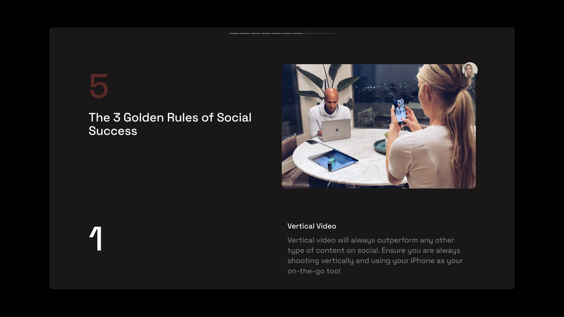
To add authenticity to her tome, Karin includes behind-the-scenes photos of herself with her clients, as well as relevant stock photos. The photos break up the text, help people get to know Karin, and showcase the breadth of what she does for clients—from helping with wardrobe selection to recording videos.
💡 Tome Tips
For visual interest, vary the kinds of photos you use in your tome. Mix it up with stock photos, product shots, or branded company images.
To add photos to your tome, tap the Add media button from the toolbar. You’ll see options to upload your own image, get AI-generated visuals, or search the Unsplash library for the right visual to communicate your point.
Use lists and tables to organize information
A successful social media strategy involves documenting plans and organizing a substantial amount of data from various platforms. In her tome, Karin explains how to define your brand’s pillars, how to choose which platforms to prioritize, and what data you need from those platforms to understand your audience.
To keep her tips streamlined, she uses bulleted and numbered lists and tables. She uses lists to share a series of questions and populates tables with examples of information to gather and input.
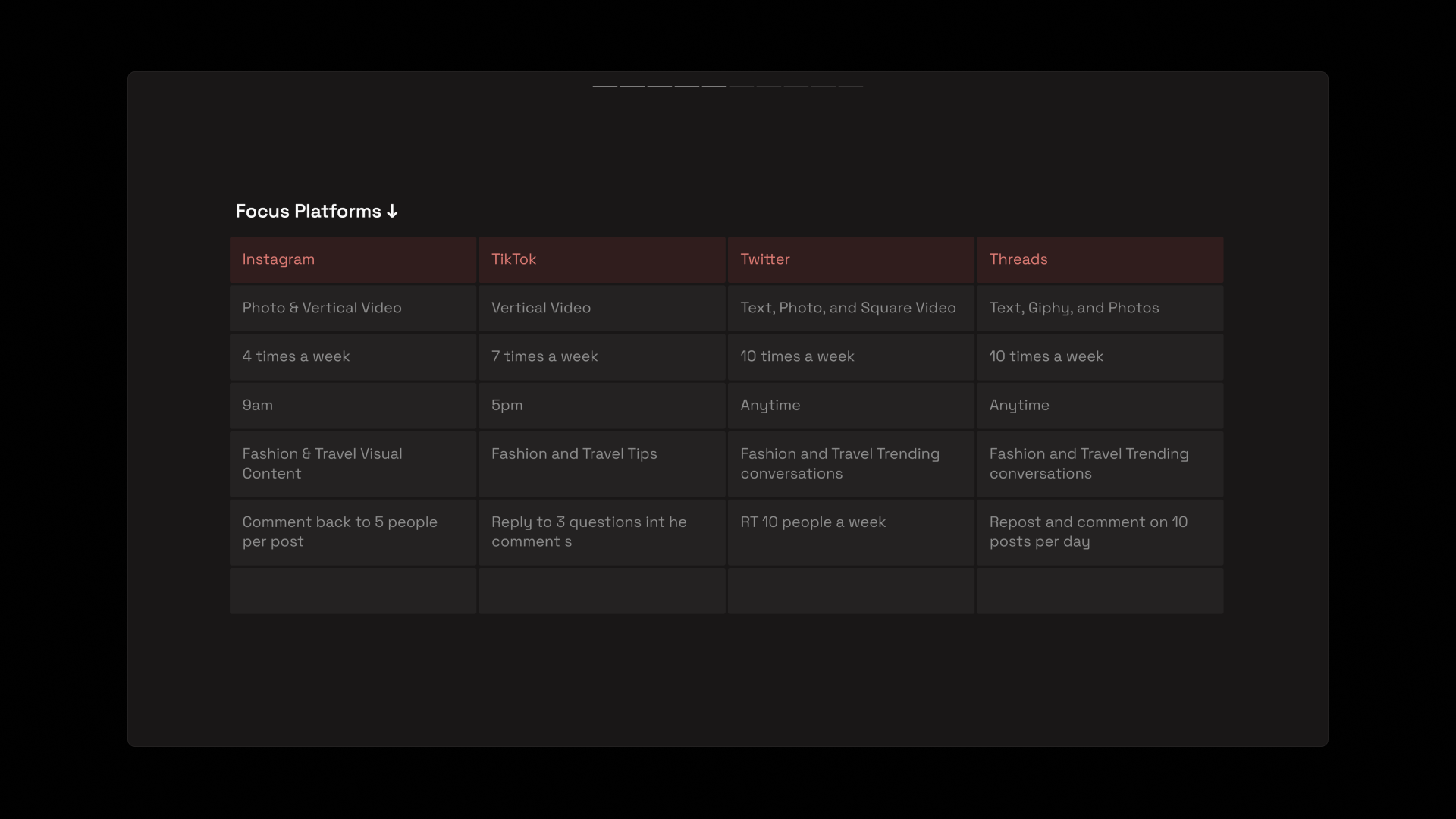
💡 Tome Tips
- Head to the toolbar to access tools for creating tables and lists. The Add table button does exactly that. Choose up to six columns across and start organizing your thoughts with panache.
- To create a list, click the Add text button from the toolbar and choose a bulleted or numbered list.
Design tip: Ensure all bullet points or line items are similar in length, so it looks and feels consistent.
Choose the best way to share your tome
Whenever Karin welcomes a new client or employee, she can customize how she shares her tome to suit the user's device. Whether through a direct link or QR code, on desktop or mobile, Tome makes it easy for people to receive and view tomes so they can focus on the content.
💡 Tome Tips
These days, everyone is everywhere all at once—messaging, emailing, using social media, and the list goes on. Tome is built to be easily shared across any of these channels. Pick and choose how you want to send your tomes.
- Click the Share button at the top right of your workspace to create a public share link, add email addresses of selected recipients, or even generate a QR code unique to your tome.
- To download a PDF, click the three dots to the right of the Share button and select Export to PDF.
Through a studied mix of AI-forward and manual features in Tome, Karin Kildow leveraged the unique features of Tome to help her quickly create a robust, eye-catching training guide. The time saved gave her the opportunity to grow her business and spend more time promoting her pro athlete clients.
Ready to create your own training guides in Tome? Get started and sign up for your free Tome account today.
For more presentation creation tips, bookmark the Tome 101 page on the Blog.
One Page Website
Tome
Project Kick-Off
Tome

Marketing Plan
Tome
Branding Proposal by Matt Chung Studios
Tome Community
You may also like...
Learn how the founder and business owner sets employee training and client education on autopilot with a multimedia tome.
Here are three ways to get started making compelling presentations in Tome, plus some of our top design tips.
